Creating an onboarding flow for Good Humans
Good Humans is a French startup building an app backed by behavioral science to help its users develop eco-responsible habits that benefit themselves, their communities, and the planet.
Problem #
Good Humans needs a way to quickly introduce users to the app and its value proposition, while simultaneously learning about the user in order to craft a personalized action plan to help them reduce their environmental impact.
Solution #
An onboarding process that first informs the user of the app, followed by a questionnaire to assess their current level of eco-consciousness and areas of concern to provide an action plan that fits their wants and needs.
Research & insights #
We began with an online survey that generated 98 responses, and by conducting in-depth interviews with five people within our expanded network whom we knew were concerned with their environmental impact to some, if not a great, degree.
From this research, we gained some key insights:
- 73% of survey respondents feel lost or overwhelmed at least some of the time when trying to manage their eco-impact.
- Feelings of guilt and anxiety are common. Users want help, but don’t want to feel judged.
- Users don’t simply want to be told what to do—they want to be given action to take, step-by-step, in a way that feels manageable.
- 84% would be interested in an app that provides guidance and recommendations.
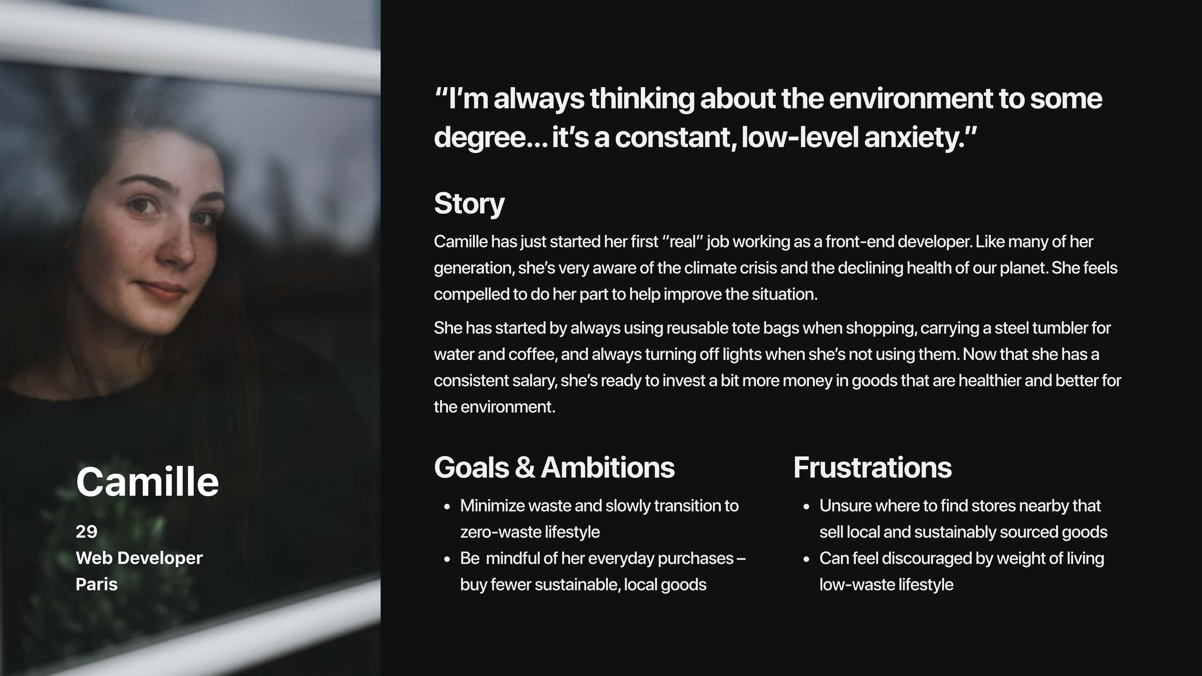
Using these insights we crafted a persona, Camille, to capture the pain points and frustrations of our target users.
Hypothesis statement
Ideation #
Knowing we would be asking users which aspects of environmental impact they felt most passionately about, we began with a round of open card sorting so we could find a shared mental model of categories.
We then began sketching low-fi screens to start piecing together the steps of the onboarding process.
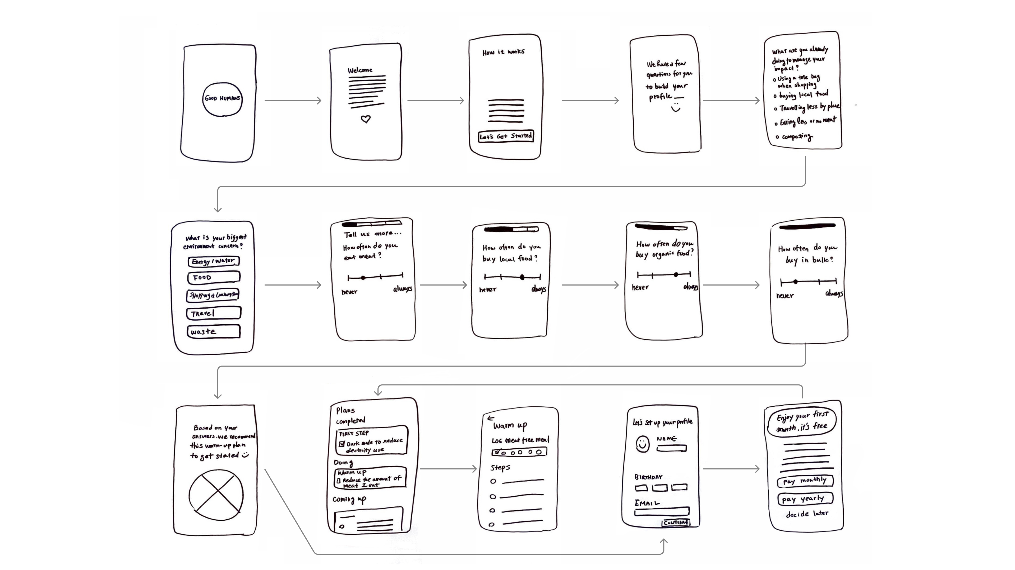
With these, we ran five concept tests and then settled on a user flow that we would use to begin creating a mid-fi prototype. The key part of the user flow was determining exactly which questions we would ask the user, and in what order.

Testing & iteration #
With our mid-fi prototype, we began usability tests which opened our eyes to some aspects that could be improved.
Information density
Our initial design for the screen where the user selects their biggest environmental priority wasted too much space, so we increased the information density.
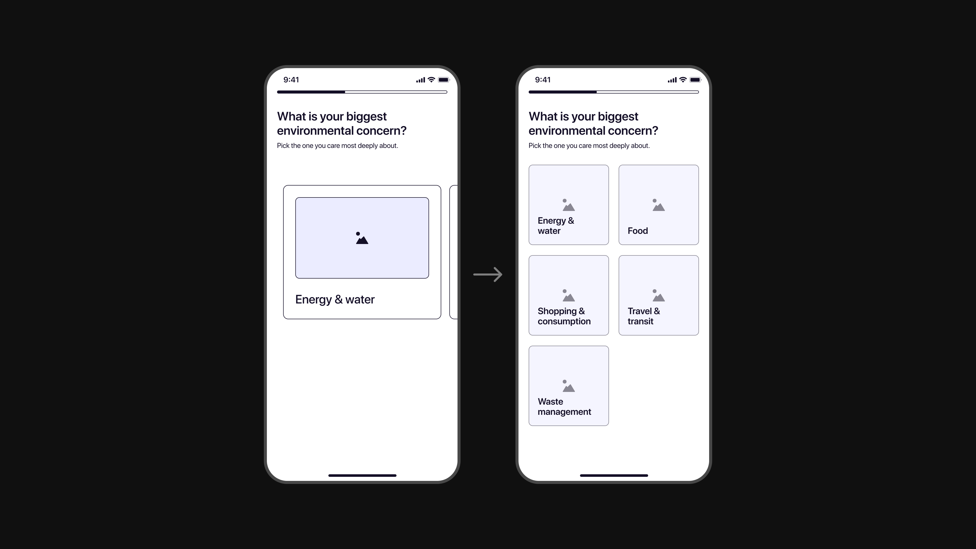
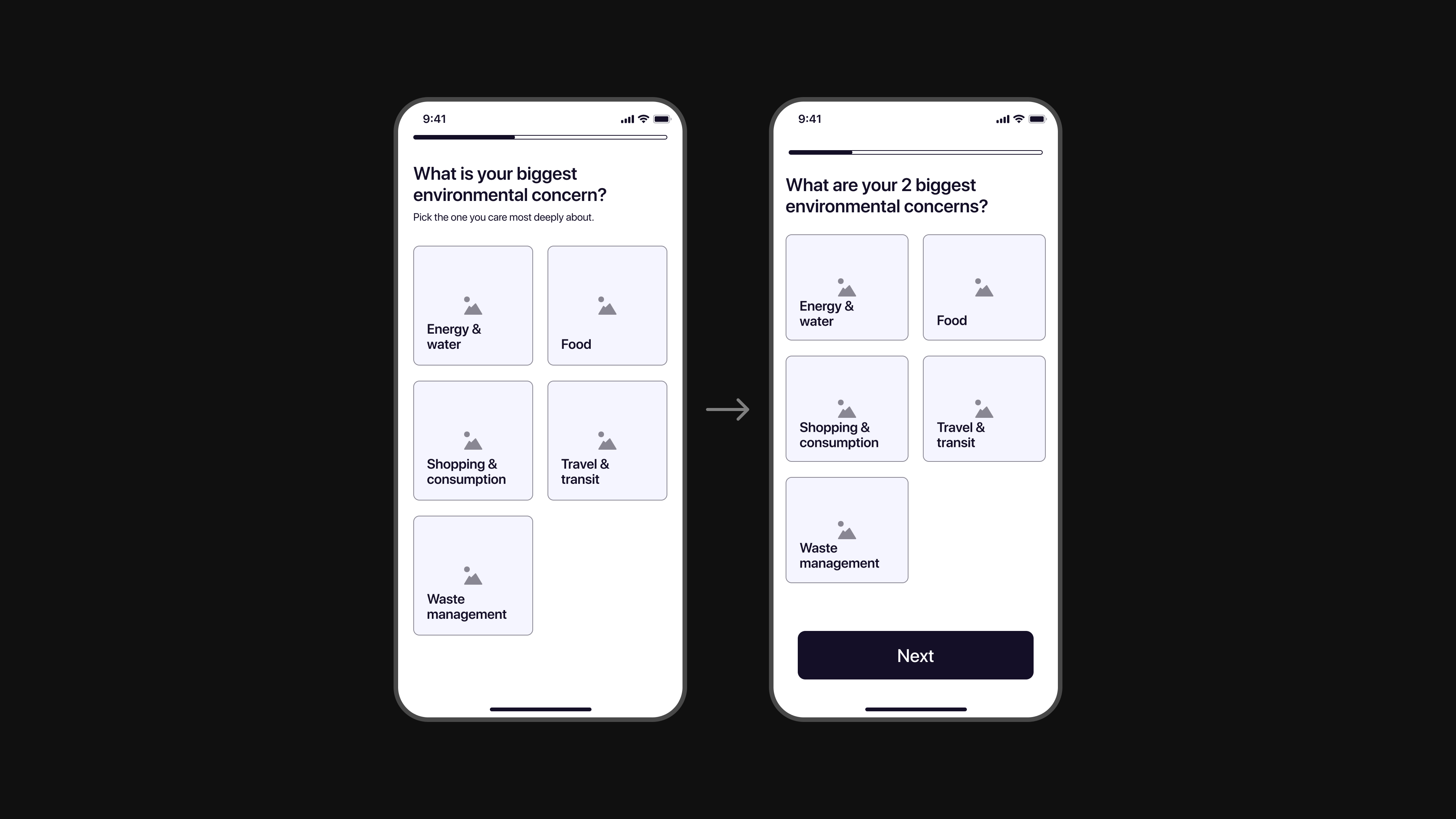
Too restrictive
Speaking of environmental priorities, our first iteration only allowed the user to pick one. Our testers universally felt this was too restrictive, so we upped the selection to two.
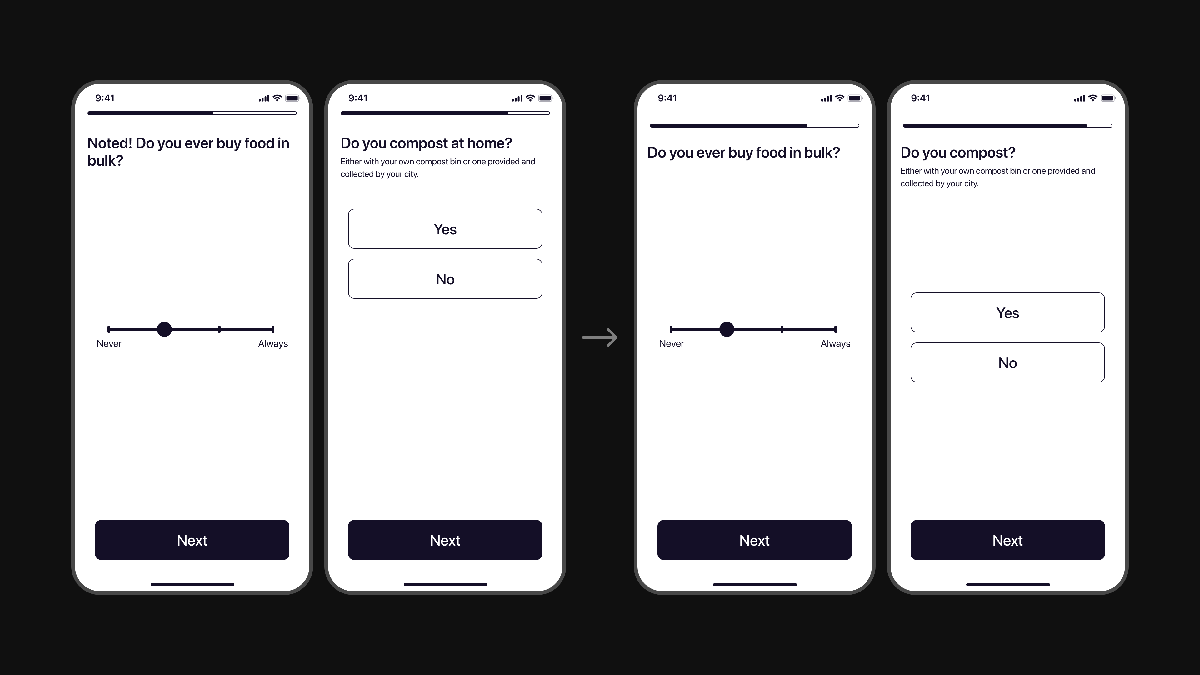
Expected control placement
We also made plenty of other smaller changes, like keeping the placement of interactive elements consistent from screen to screen throughout the questionnaire.
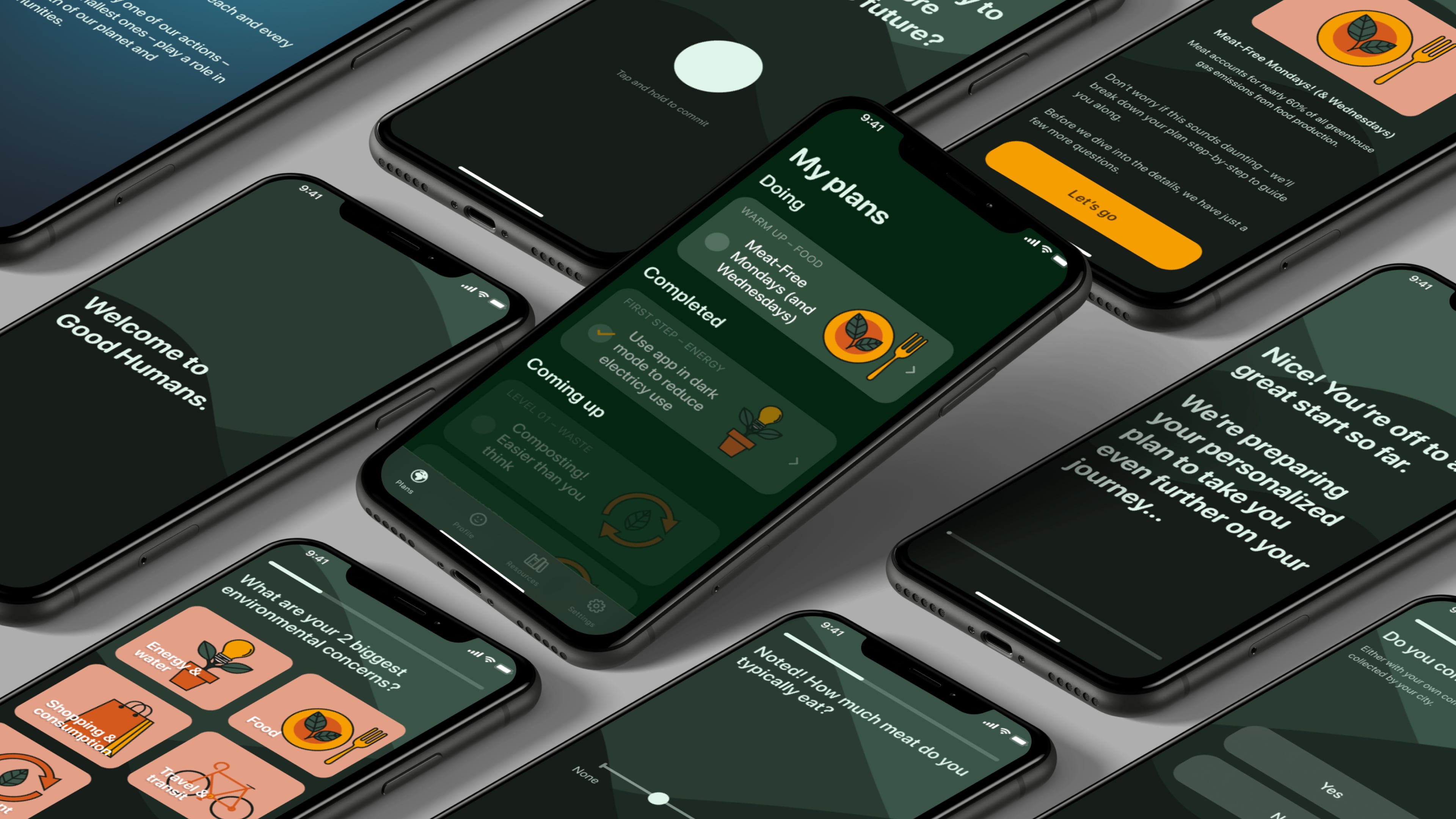
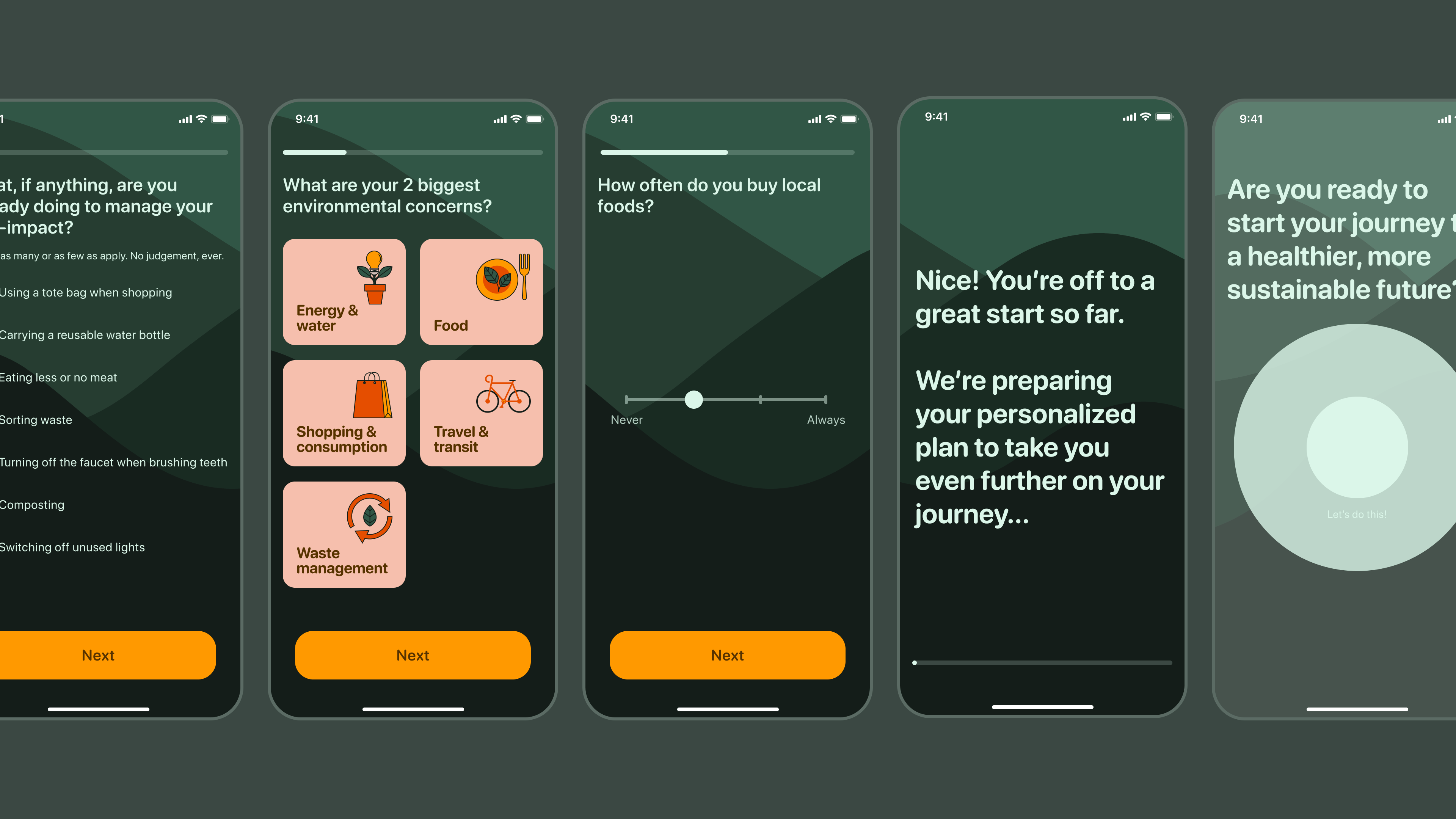
Finally we were left with an onboarding flow that consists of:
- a quick explanation of the app’s mission while ensuring the user that their actions make a difference,
- a questionnaire that assesses user’s priorities,
- a hint at the action plan they can expect and a commitment from the user,
- an overview of the pricing and trial structure,
With our user flow iterations complete, it was time to define the visual style and move into hi-fi.
High fidelity
With our user flow iterations complete, it was time to define the visual style and move into hi-fi. Based on our user and competitive research, we knew we wanted the app to have a tone that was:
- warm,
- soft,
- and inviting.
It was also important to the clients that the app interface utilized dark mode. Darker colors consume less energy—especially with modern OLED screens—so designing the app to prolong battery life was a great way for Good Humans to practice what they preach.
With these principles in mind, we crafted a moodboard that they were very happy with.
Delivering the final prototype #
After exploring a few different styles based on our moodboard and running desirability tests, we settled on one that leaned into the greener earth tones and felt appropriately soft and inspiring. Specifically for the onboarding experience, we wanted to invite the user into an uplifting world with a sense of forward movement. We delivered a prototype of the entire flow.
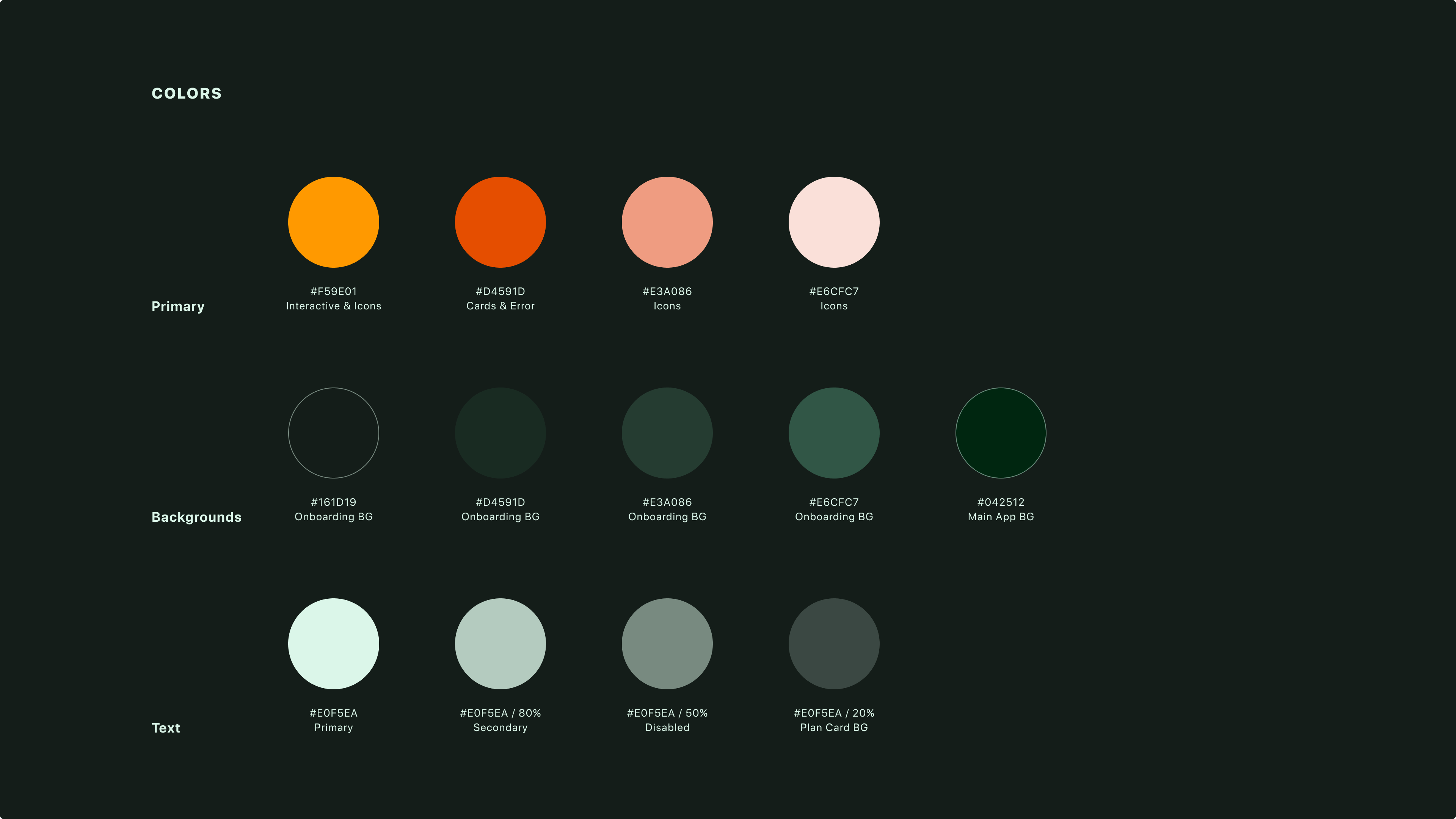
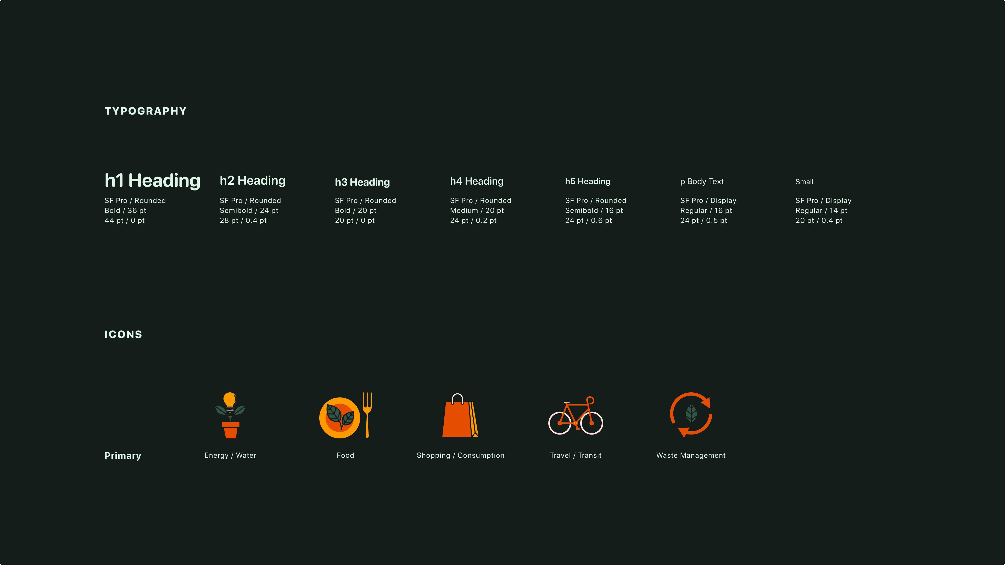
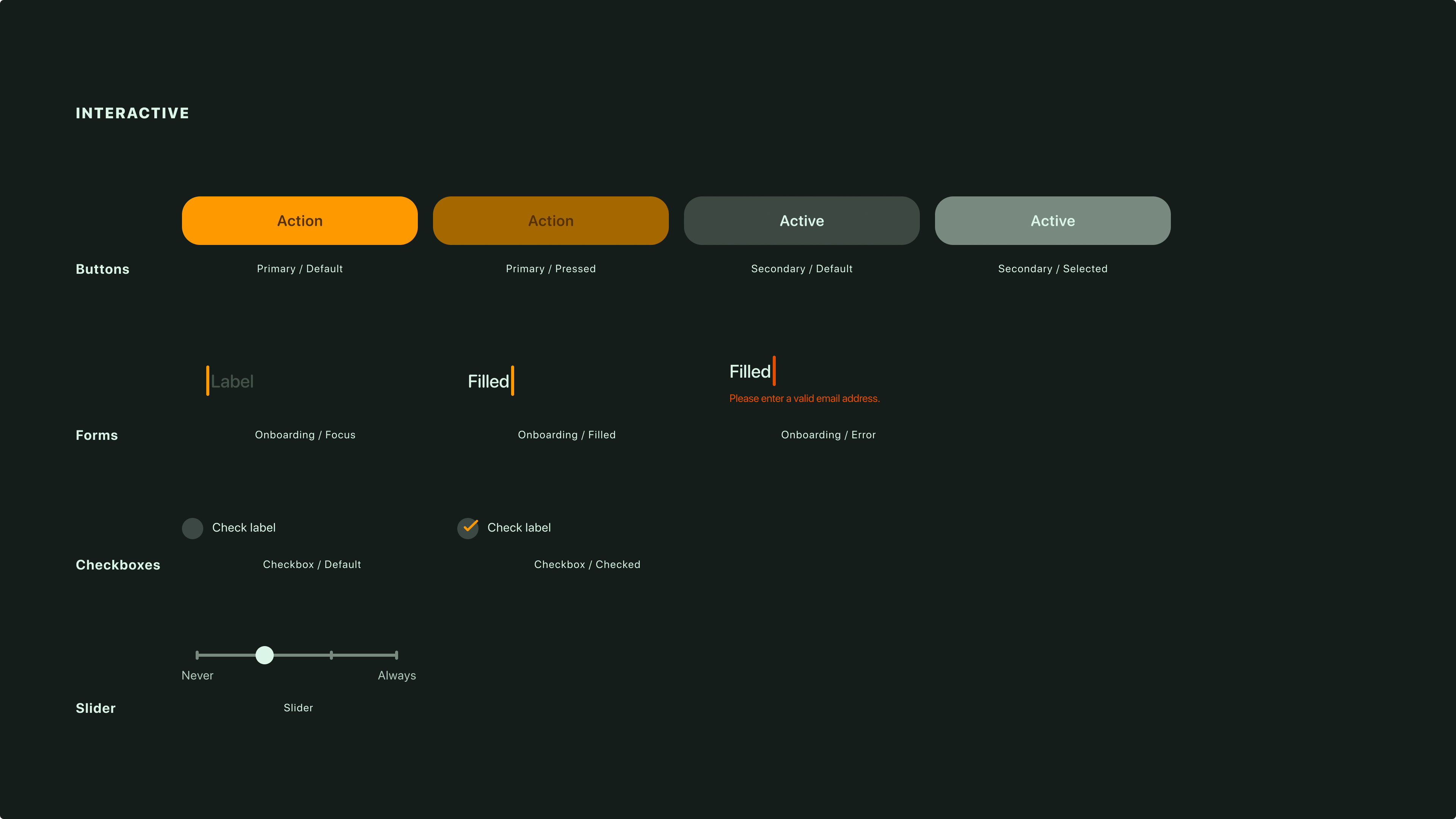
In addition to the prototype, we delivered a style guide that could be used as the rest of the app is built out, which includes a color palette, text styles, an icon pack, and styles for interactive elements in all of their states.
Retrospective #
After the completion of this project, my design partner and I were asked by Good Humans to continue working with the team to design the rest of the app.
The clients made it clear from the beginning that putting the user first is a top priority for them, and this project was a great opportunity for me to align user desires with the business needs of a brand-new startup. I’m excited to continue working with Good Humans and help bring the app to life. ☼