MESH Redesign
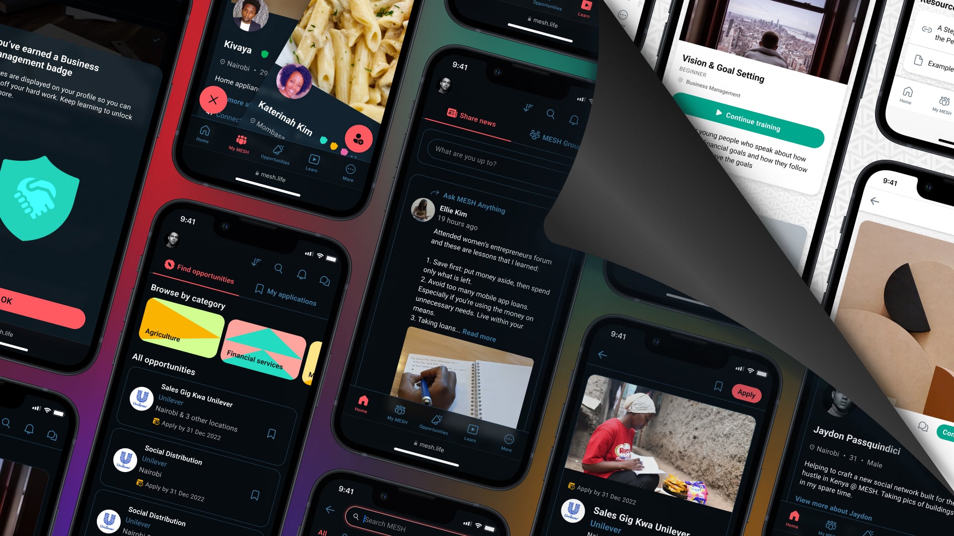
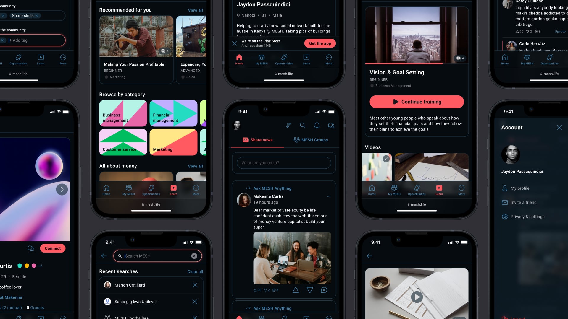
When MESH updated their brand identity, I created a harmonious new style guide and component system to redesign the app from the ground up.
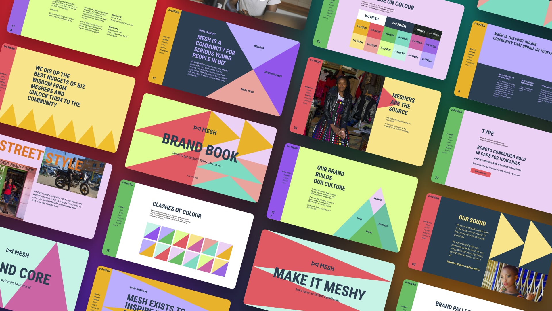
In mid-’22, MESH underwent a complete identity update. It was a radical rethinking of the brand with a new visual language, tone of voice, and clarified mission.
I worked with the brand team to take the visual identity they had created and expand upon it to suit the needs of the app.
It was a vibrant new look that proved challenging to translate to an interface. Some of the color combinations didn’t pass accessibility requirements for contrast, and triangles — a key part of the new identity — don’t exactly lend themselves to box models.
New style guide #
An interest in designing the app in “dark mode” was expressed, and I found that the bright colors worked well, with plenty of contrast, against a dark background. With the OK from the brand team, I built upon the core palette a collection of dark blues to use as background colors and a range of neutrals for text.
I explored many options before we finally settled on Raspberry as the primary accent color — using it for buttons and active indicators — with the rest of the palette filling secondary and tertiary roles. I added a harmonious blue to complement Raspberry and signal interactivity.
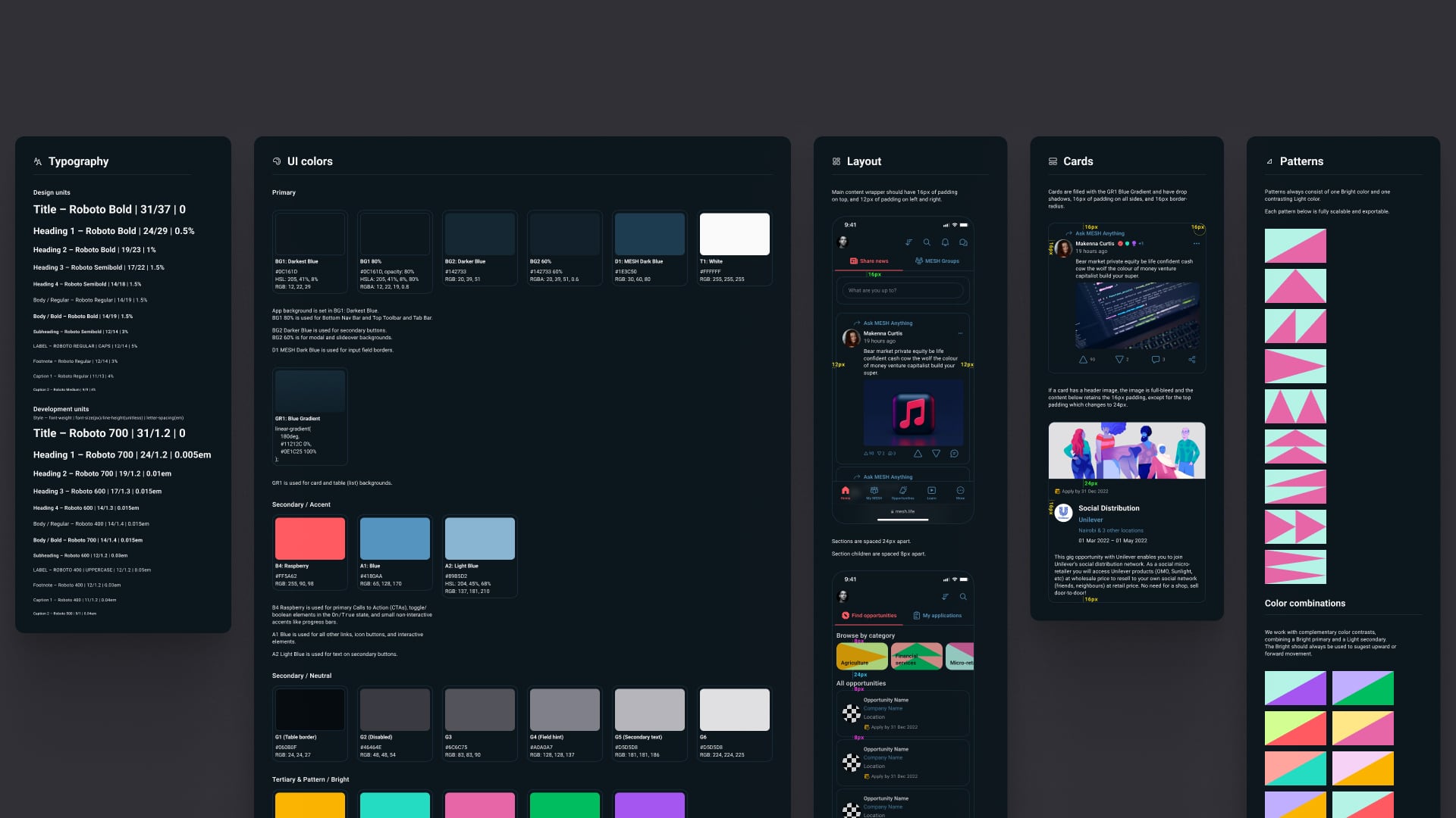
In addition to the color palette, I defined typography styles to be used throughout the app — all using the brand typeface Roboto — for elements like body text, headings and subheadings, and captions.
Samples from the new style guide specifying typography styles, interface colors, layout spacing, and brand patterns.
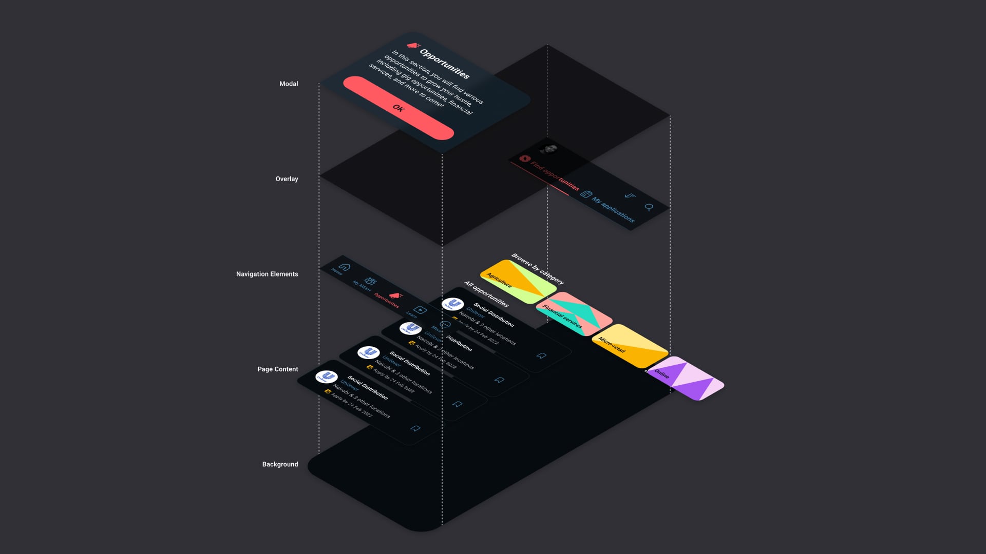
A page from the new style guide displaying the app’s layer hierarchy as well as components like modal sheets, the navigation and top bars, and cards.
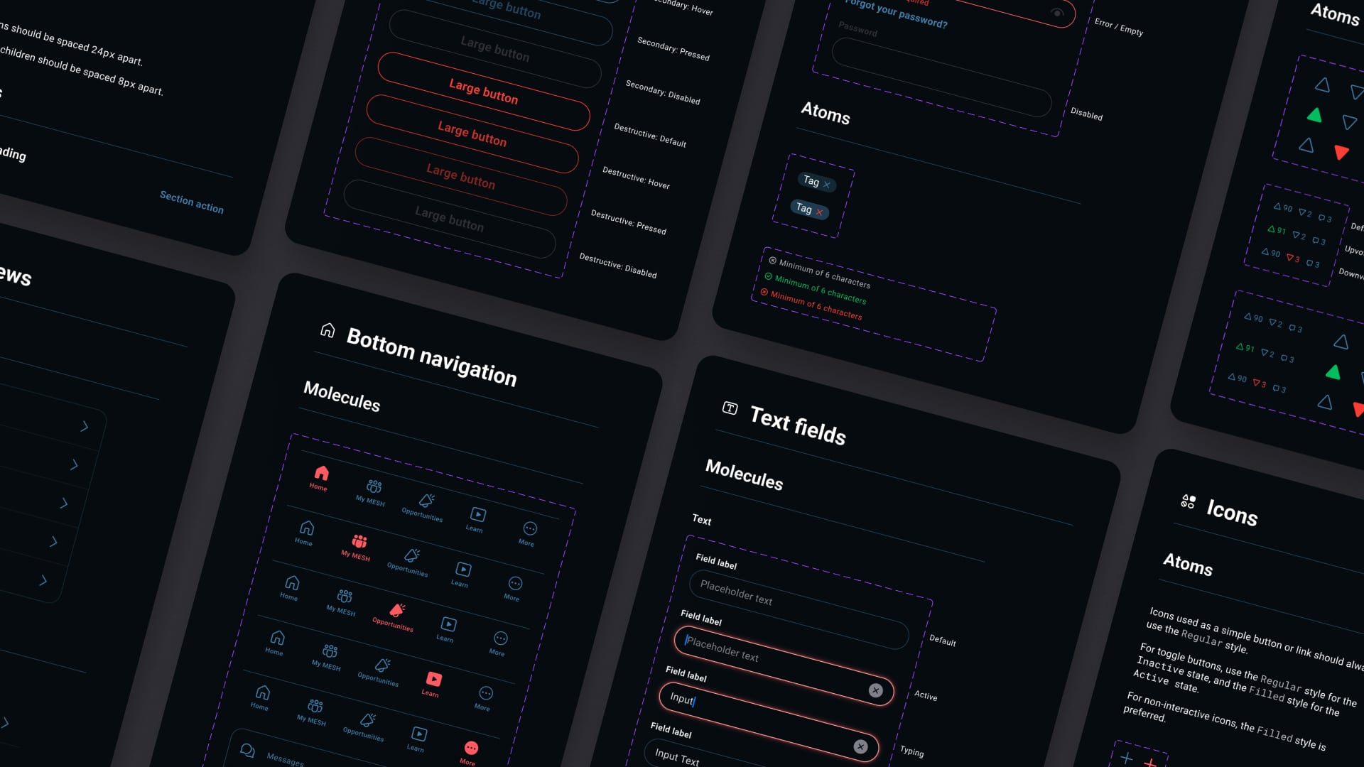
Atomic component library #
With these new styles I overhauled the component library, allowing me to quickly iterate as we built out new features. These would also serve the development team as they implemented on the live app.
The library contained the “building blocks” of the MESH app — elements that would be reused throughout the interface. This included bits like buttons — including different sizes and all different states, such as enabled, hover, pressed, and disabled; table views which list rows of content; input fields like textboxes, dropdown buttons, and checkboxes; cards defined by blue borders with rounded corners; alerts prompting action from the user; and many more.
Day to day I utilize as many existing components from the library as possible, while continually adding to it as we build new features which require specific new components. This significantly speeds up my work, allowing me to iterate quickly, make changes and improvements on the fly, and push changes to existing designs with ease.
Reception #
The redesign was a big success upon launch, with users praising the new look.
In love with the new updates. Smooth and cool.
—MAY Upscale CBO
Dark mode imeweza 👍 na logo pia lko tops!! I really love all features 😊
—Emily Wairimu
I love the new UI it is very interactive and warm
—Peter Kariuki
Site running so smooth. Upvotes zimekuwa now easy to work around. Just awesome.
—George Kyalo
Best updates so far 🔥🔥🔥🔥
—Ellie Stae
What’s next #
In addition to adding new features and refining parts of the app, I’m working on some visual updates to further aid with usability and discoverability that I’m very excited about.
As for details… 🤐
You can check out the app for yourself here.1 ☼
- Best viewed on mobile or with a simulator — as of publication, the desktop design has not yet been deployed as non-mobile traffic is nearly non-existent in MESH’s market. ⤶
