Early Iterations at MESH
Visually refreshing a young app to bring consistency and scalability.
MESH is an online community for the Kenyan biz space. It fuses social networking, skill sharing, and job opportunities to give young entrepreneurs a leg up.
I began working with MESH in early 2022 as the sole UI designer. With no existing style guide, I updated the interface with an iterative visual language and built out a component library to easily scale across the app. We also began to design new features — I would build a prototype based on a user story, UX would test, and I would iterate.
Initial visual refresh #
When I first started at MESH, I was asked to refresh the design of the app. It had been built without a complete style guide and lacked coherence. This early refresh was meant to modernize and refine the app without taking too sharp a departure from the existing identity.
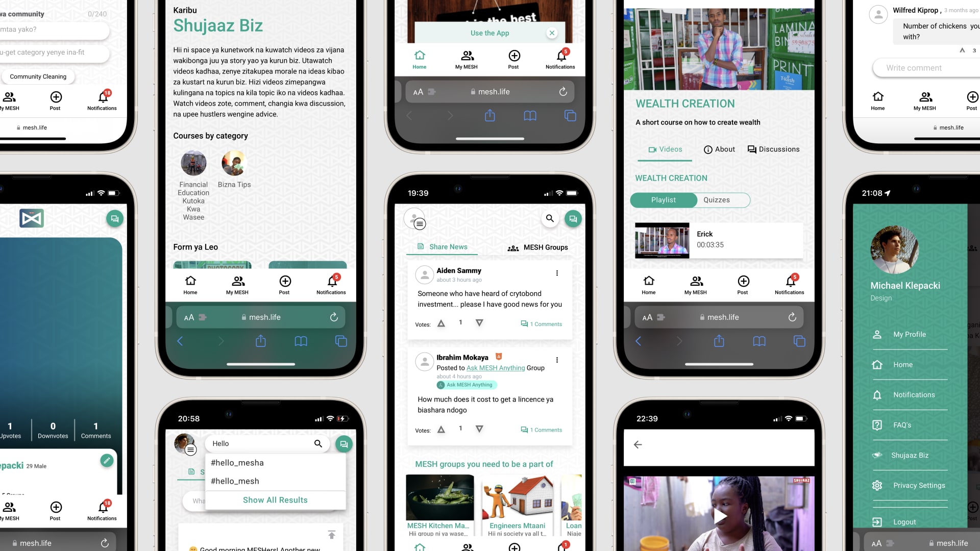
Without previous documentation, the live site served as guidance for a baseline. I constructed a functional color palette that felt familiar to the existing palette; specified type styles and how to use them; and harmonized our icon set by handpicking a selection of Microsoft's Fluent UI Icons, which strike a good balance of professionalism and approachability.
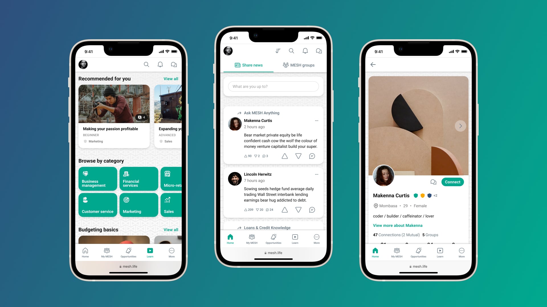
One of the most important steps was clarifying the hierarchy and creating a consistent navigation paradigm.
- The bottom navigation bar would be used for the most important pages of the app.
- The top bar would be dynamic, with the right side offering relevant controls for the current page.1 The left side of the top bar gave quick access to the Profile panel, or changed to a back button as a user moved deeper into the hierarchy.
- A tab bar just below the top bar would handle sub-level pages.
The dynamic top bar, top tab bar, and bottom navigation bar make control and exploration more predictable and discoverable.
The refresh was a months-long, piece-by-piece process. The navigation improvements, style guide, and component library gave me a solid base as I completely redesigned entire sections of the app.
Rethinking search #
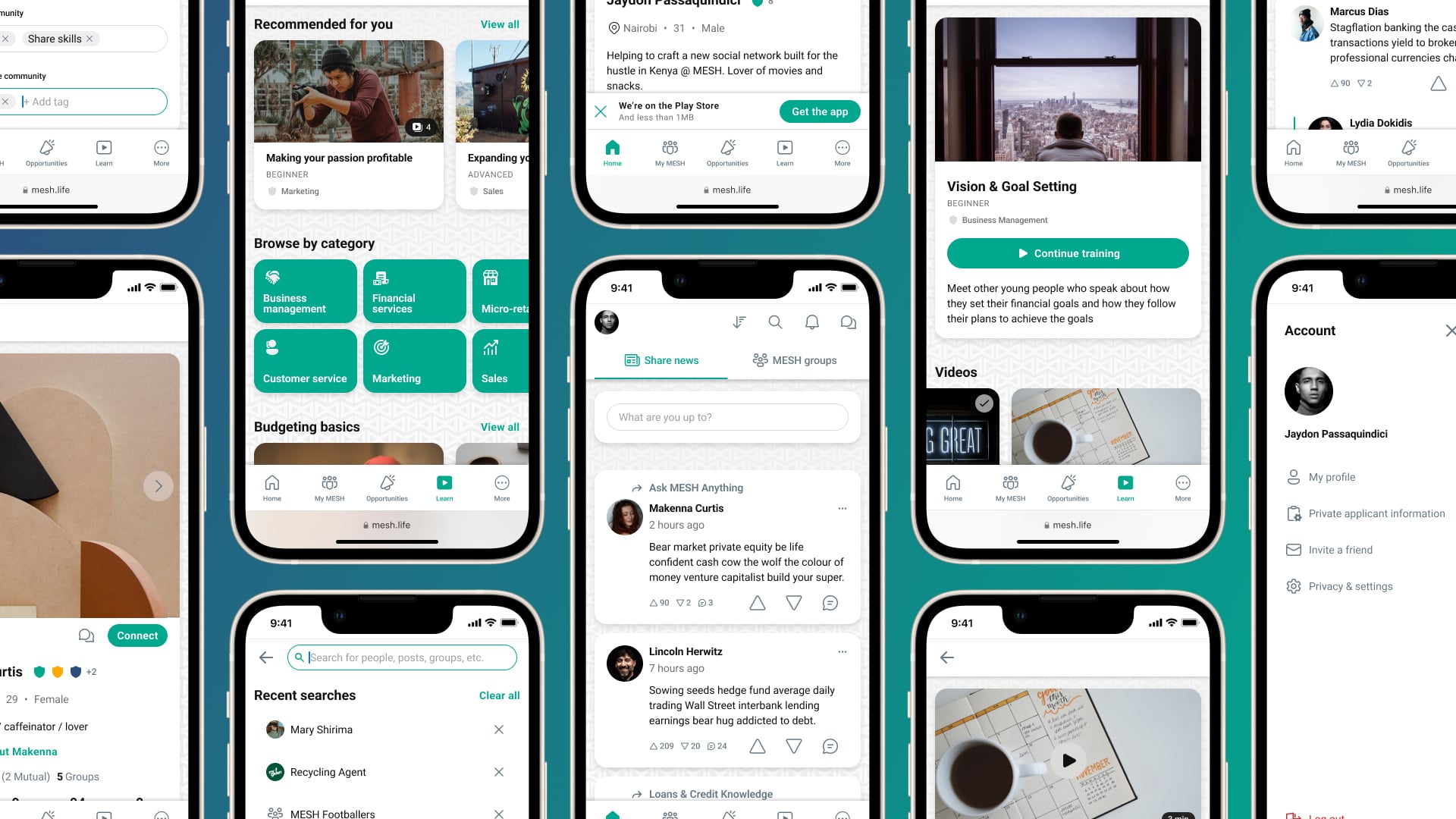
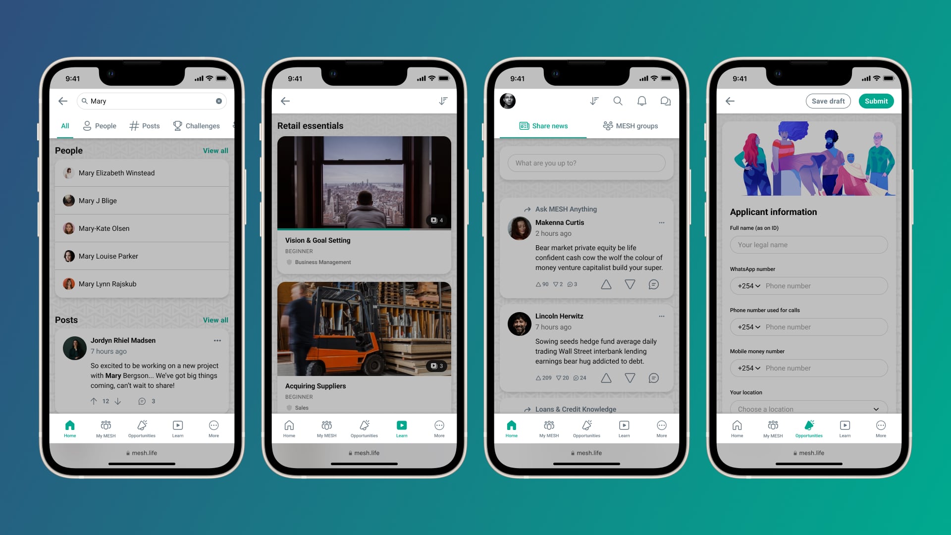
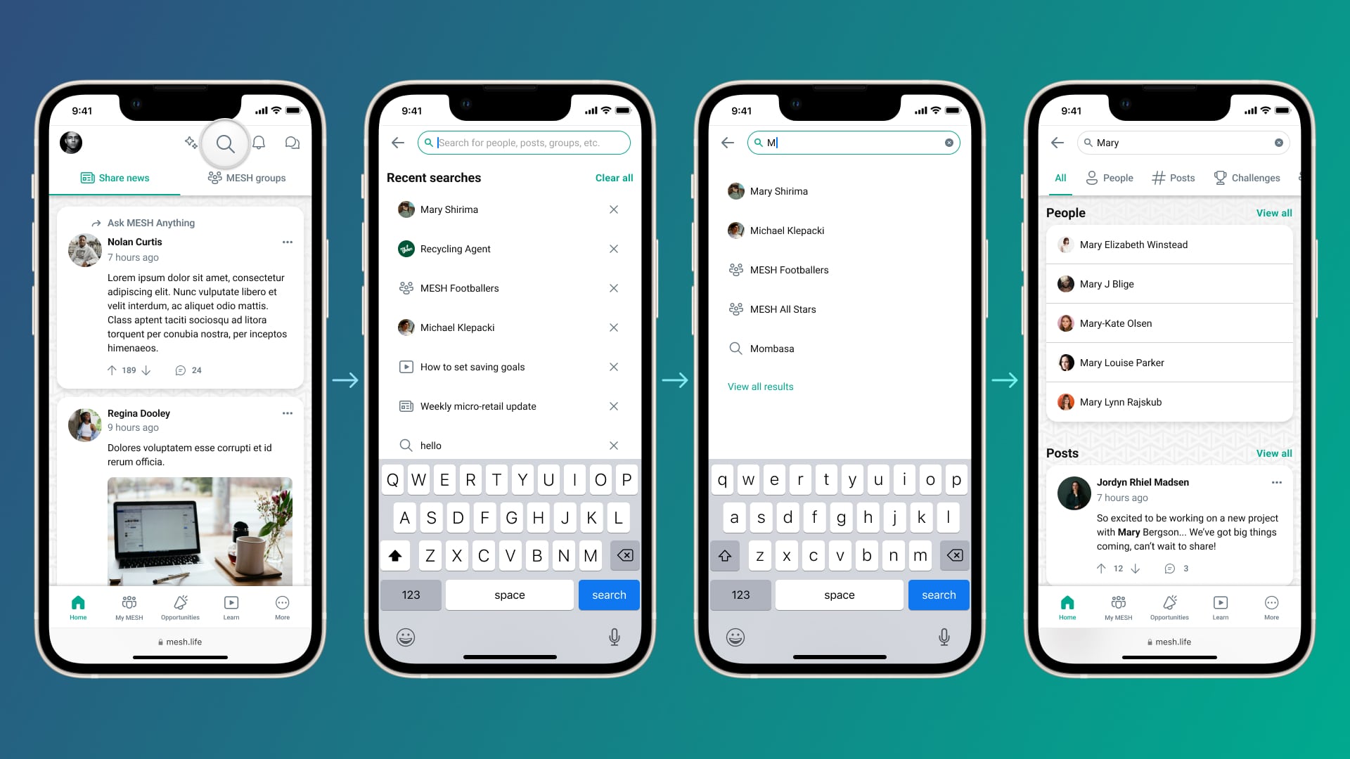
One area we sought to tackle was search, hoping to create a whole new experience to go along with a rebuild of the tech by dev. I abandoned the previous small auto-complete pop-up for a full-page design that surfaced a user’s recent searches, offered live suggestions, and presented filterable results.
The completed prototype tested well, but unfortunately the feature never shipped as other projects took priority.
Learning modules #
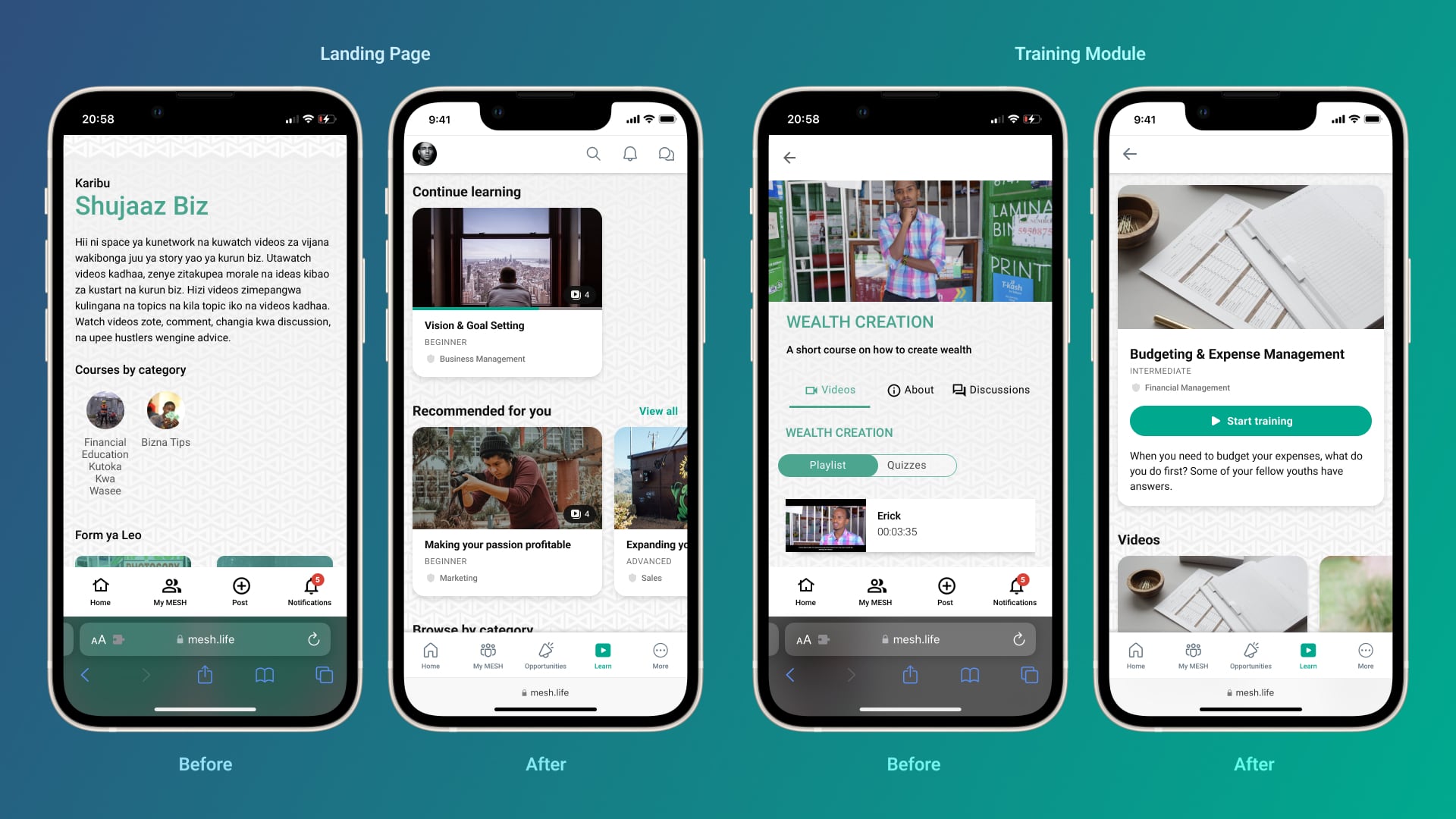
We also reimagined the experience for MESH’s training modules. The Learn page is one of the most important parts of the app, designed to help give users the skills they need to start and grow their own businesses.
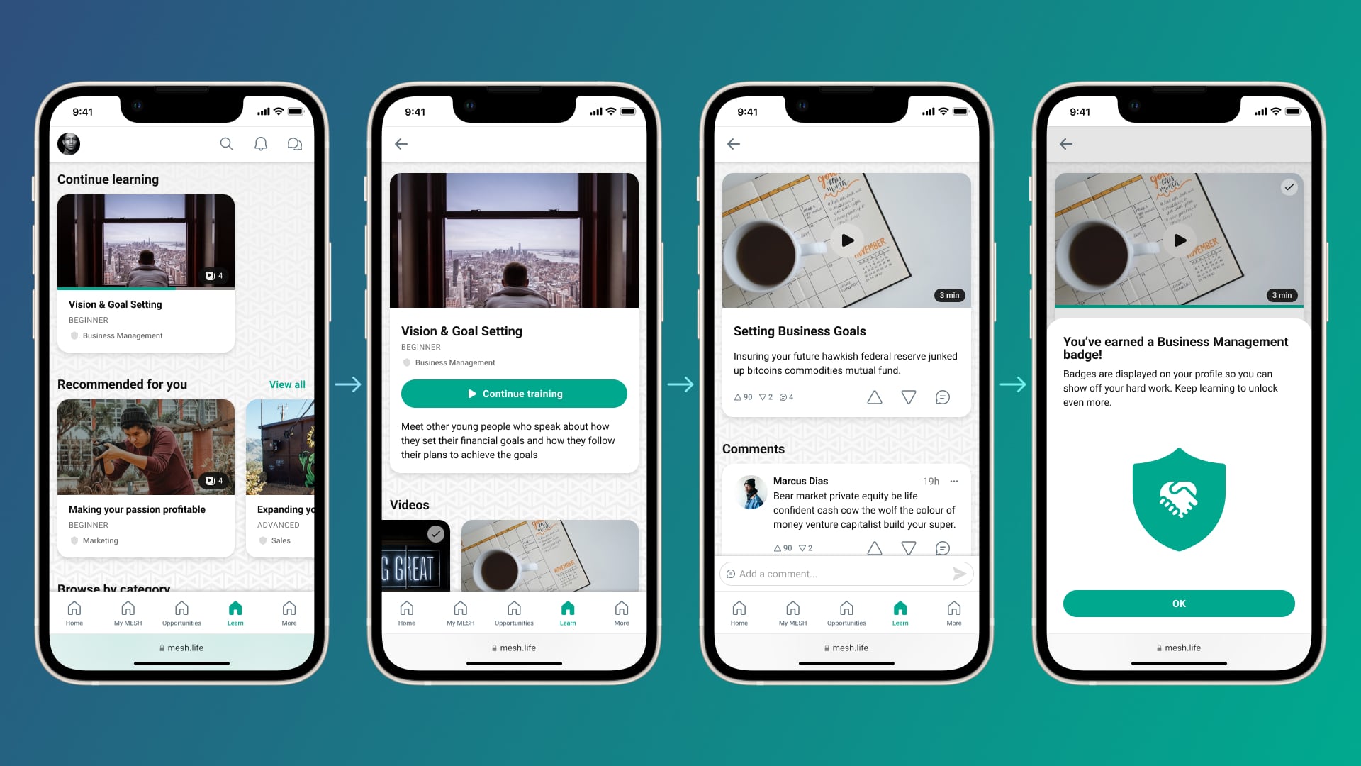
I placed the modules front and center — no longer buried below a wall of text — and adopted a design more familiar to users of streaming apps. A “Continue learning” section lived up top if a user had started any module, followed by recommendations, categories, and curated lists. Selecting any module presented a large button to jump right into the training, with included videos and supplementary materials listed below.
Watching videos would earn users badges that would be displayed next to their avatar and on their profile page. And to promote community, videos could be discussed in a comment section below.
Just the start #
This early work helped the development team begin adjusting to a component-based system and gave us some good bones to build on top of — without being so drastic a shift in visual language that we would alienate or confuse existing users.
I soon saw that even bigger changes were on the horizon. ☼
- We also included quick links to DMs and Notifications. There wasn't space for these in the bottom bar, but it was decided these needed to stay plainly visible, so this was the compromise. ⤶
